Hitensile has a new face lift

Newcastle Hitensile and Bolt have had an exciting upgrade.

A fresh lick of paint, new signs, new car park lines and markings and the tired old building looks brand new again. Perfect for our snappy photographer to capture this industrial beauty.


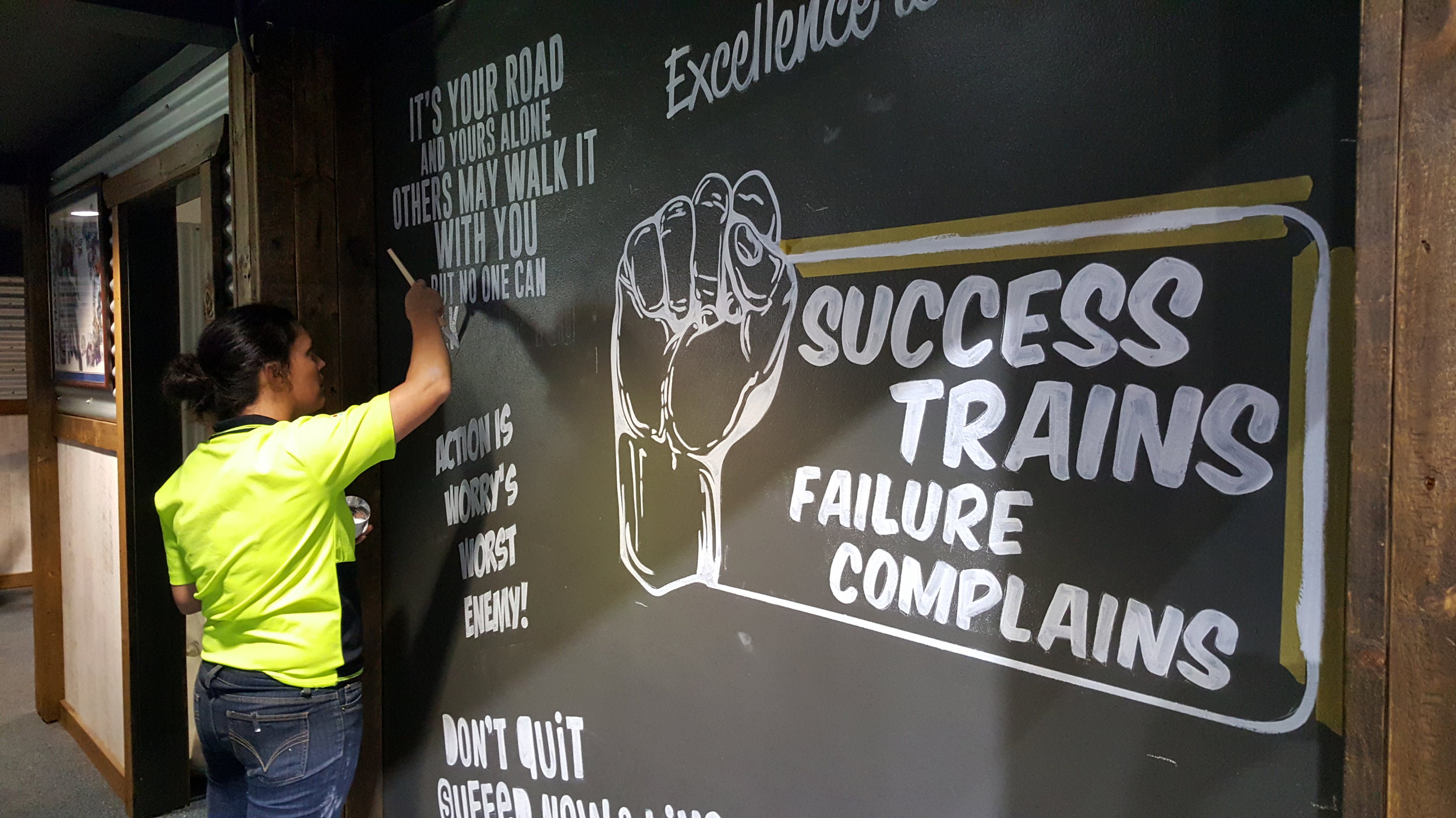
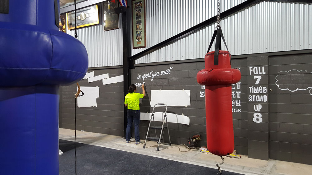
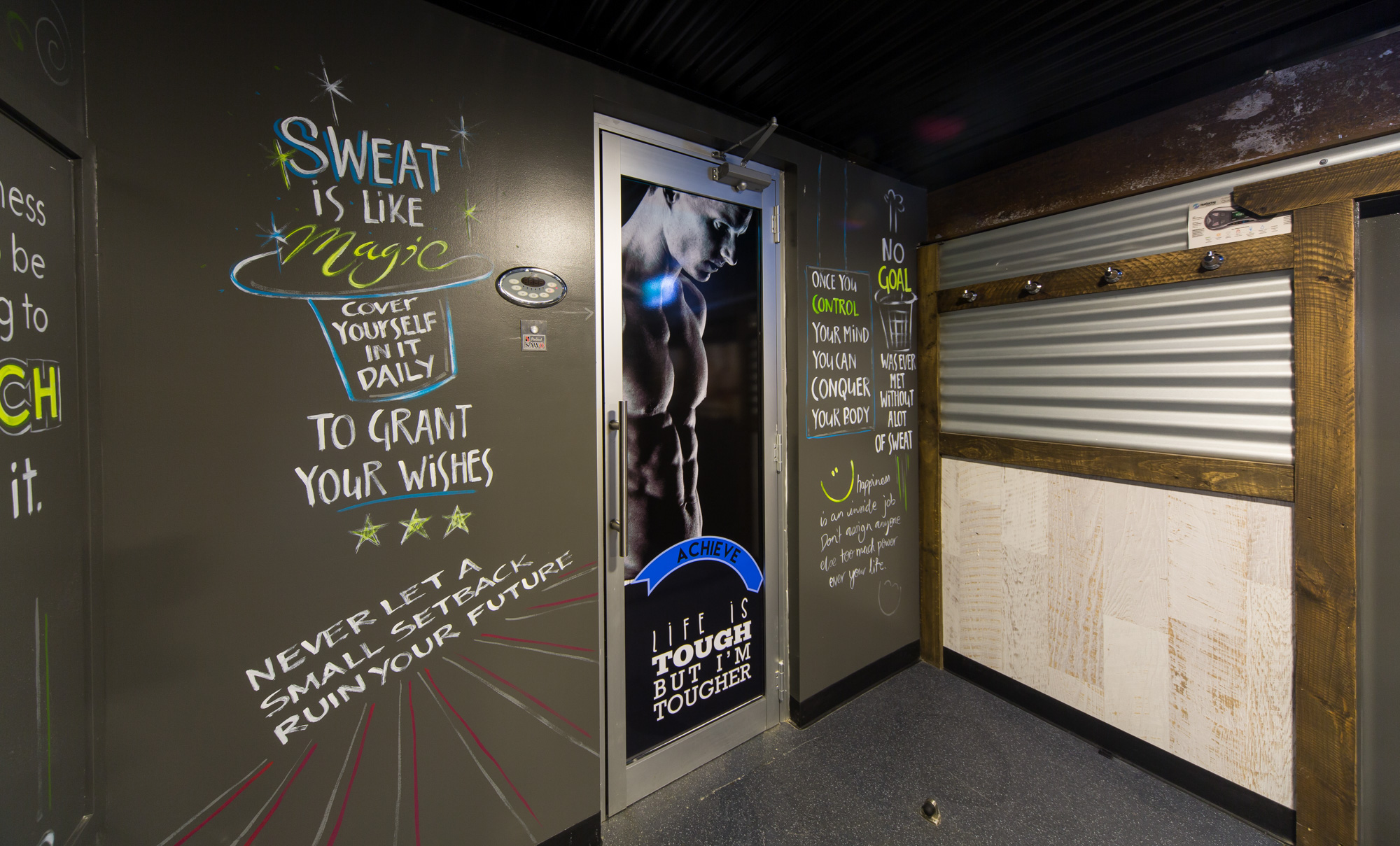
It is amazing how powerful words are really. The visual impact of such strong and contrasting tones the words bring across the front facade of their building is impressive to say the least. The Building now has it’s place along the road.


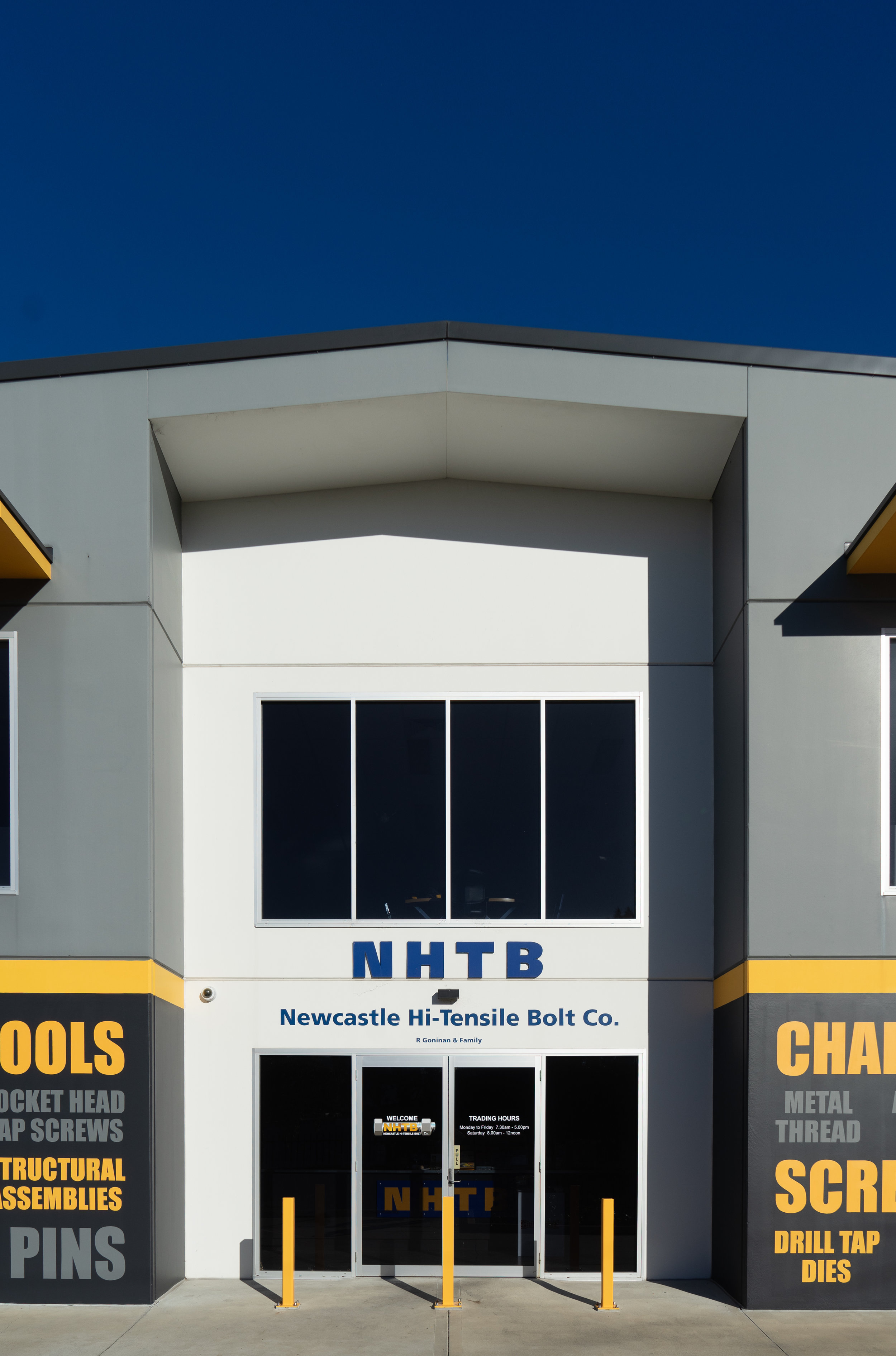
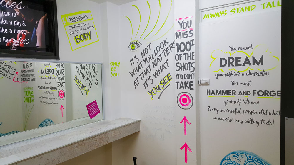
The task on this site was to freshen up the front where the customers enter the building. So our Think Team got working and created this idea of a collage of words, relevant to Hitensile of course. There were some extremes in temperatures and weather, but the results of the hand painted words look fantastic we think.

Standing tall out the front the pylon sign had a make over as well- new sign panels with the new logo and branding. Trading hours applied to the front entrance doors.

We cannot forget the ground! New lines were measured out for the spaces and the car park markings were also repainted.

For the final touch a bit of painting across the front and shiny yellow bollards for greater safety around the site.

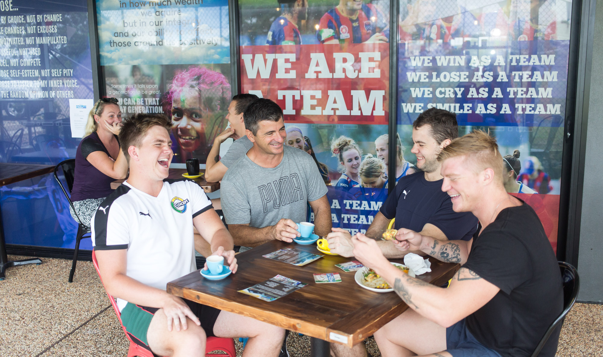
All that was left was to capture the moment of such brilliant silent acting. So with camera in hand, our photographer Andy snapped away. The model was a minx, such strength and poise, every angle was her best. :)

printing service


Think Graphic Communication offer a state of the art efficient printing service to business and the public.

Our range of items include, but are definitely not limited to: Business Cards, Booklets, Letterheads, Brochures, Triplicate Books, Invitations and Calendars.

What sets our service apart from a lot of competitors is our trained graphics team and the speed of our response to your request.

Our aim is to make your purchase as carefree as possible.

Everyone has a special offer nowadays and Think Graphic Communication are definitely no different in that regard.

start with the outside first

Your shopfront appearance is a key factor to getting customers in

If you are looking to attract more attention for your business – start with the outside first - shopfront signage.

Fascia signs, lightboxes, hanging signs through to frosted film windows or one way vision

Our team will collaborate with you to help transform your shopfront almost any way imaginable.

Being able to create and express your image to the public is such a rewarding project


Splash Puppy RV signed off


Keep an eye on the road for this big rig!

The crew from Splash Puppy will be on tour around Australia offering dog washing and grooming and quality retail products.

Acting as sales representatives Ray & Jenny showcase grooming products and equipment for leading wholesale grooming businesses including Petway Petcare.

 
splash puppy crew.jpg

We both love dogs

and have 20 years combined experience working within the dog grooming industry

Our job was to get their massive RV and trailer signwritten and ready to hit the road. In this case this was pretty easy as the artwork was supplied by Jenny with only a few tweaks to be made, then it was right to print. 

Bright colours, easy lettering, point forms and a puppy who wouldn't love this sign?!


For everything 'Doggy' Call 0438 369 399

Thinking Yoga with Sarge

This week we were a bit flexible and spent some time with Sarge at the Ohana Room in Cardiff

royce-at-ohana-applying-window-graphic.jpg

Ohana Signs


New face for the family Yoga room


Clean and simple was Sarge's request for these signs.

To get the message across quickly and easily from the carpark, decals were applied to the internal of the window panels. We used a medium weight  fontstyle keeping the sentences short and sweet, and kept the heart of the sign for the glorious Ohana logo.

 
royce-at-ohana-applying-window-graphic-silhouette.jpg
 

The Ohana Room means, 'family room' in Hawaiian

Of course we couldn't go there without actually striking some yoga poses for our pics. Even at 32 weeks pregnant Sarge is way more flexible than the 2 of us, and funnier too


I think that was Tree pose then it was time for Ballerina pose


If you are looking for a place to practice yoga you can't go past here. Sarge is a bundle of energy and always good for a laugh. They have members ranging in age from 6 weeks old to 81 years of age! 

A variety of Yoga Classes are on offer catering for Mums and Dads, Over 55's and serious Yogis intent on getting a sweat up in Hot Power classes. There is something for everyone at The Ohana Room. 

Mats and equipment supplied

 All you need to bring is a towel and a smile

ohana-yoga.jpg
the-ohana-room-yoga.jpg

The Concept brought to life


Think Graphic Communication helped make Newcastle's Newest Sporting and Fitness hub's dreams a reality!
 

The Concept Gym we shopfitted in Newcastle, is now located 16 George St Highfields right near the Azzurri Club and next door to our mates at Sports Clique

The Gym has loads of Hammerstrength Equipment, Group Classes, Crossfit and recovery facilities.


Similar theme to the old gym


1000s of Hand painted affirmations on the walls driving you to keep going!

Bright fluorescent colours highlight certain words for greater impact a theme carried out throughout all the rooms.

Higher up on the shed the walls are filled with sports memorabilia from all different codes - it looks amazing


Logo design


Josh Vincent tweeked the old logo and created a great brand for the new gym.

We branded the gym by clever placement of routed logos throughout the different spaces, adding more colour and life

Energetic sports images and the gym's slogans were combined for the front entrance on the automatic doors, designed creatively for an impressive lasting impact.


Every angle holds a message


Looking up we even applied decals to the support beams and metal framework

Custom canvases were designed and manufactured along with large posters and small framed posters and decals for mirrors


Custom signs made for every surface


For impact and colour one way vision was cleverly designed and applied to the front main doorway and back entrance to the cafe.

Support for local sporting teams were featured here along with more affirmations based around sporting teams. So when the teams are practicing in the nets, or just passing by they can be inspired to strive for greatness.


Privacy was established by using printed etching and printed images for doors and windows


Once again strong, powerful, uplifting images appropriate for the different rooms were applied throughout the gym such as the spa room below.

Every message used holds something personal for each individual.


The Concept Gym Newcastle packs a punch

The Think Team were at their best with this fitout at The Concept Gym.

There were so many interesting signs and displays that were custom made for the gym. From the moment you step out of your car you are met with the stunning figures and bright colours that just make you want to go inside and workout.

Here we achieved this great impact with the combination of one way vision, which allows light into the shop but you can see outside from the inside, fresh yellow and routed ACM sign for the main sign.

Step inside and it is just amazing!

Everywhere you look there are inspirational quotes and messages urging you to strive for your best and to keep going, never give up.


Walls, doors, windows even the equipment was used as a blank canvas.


Hand painted messages, posters, decals and canvases adorn the walls

Custom made canvases were made for the gym and hung, posters designed, decals laminating timber, punching bags or the lockers or even the toilet doors were applied. Each message was hand painted adding a personal touch, as if one of the members had drawn it themself.


In the Spin Room the Sydney Harbour Bridge and more inspirational quotes on the walls illuminate once the lights go out and the music starts pumping

 
the concept illuminate hand painted sign think graphic communication.JPG

watch this glow

This is amazing to see


We are so proud of this job and it was such a lot of hard work but soo much fun especially because of the great crew that work at the gym and helped us in any way that they could.


Pacific Holden has Courtesy wrapped up

Recently we applied new signage to Pacific Holden Gateshead's Customer Courtesy Vehicle. This not provides a great service to us the customers, but acts as a mobile advertising billboard as their happy customer drive around in this Astra.


The vehicle wrap was kept in same design as Pacific Holden's other vehicles 

This makes it easy to recognise and a memorable advertisment


Bold lettering, easy to read, a slight angle for a dramatic effect, and simple colour scheme with a band of red to grab your attention, is all that was needed for this sign to work.


As one of the newest Holden dealers in the Hunter Region, the friendly staff at Pacific Holden are there to assist you with any service, new and used vehicles or parts enquiry that you may have. 

They are located in Gateshead, near Newcastle and Cardiff and service the surrounding regions of NSW.

They boast a modern showroom and large display areas which allow customers to casually browse the great range of Holden Vehicles. Friendly staff are specialists who are proud of their association with General Motors Holden, are very helpful. They were easy to talk to and were happy to help out in any way even if it was just moving cars or cleaning the car for us before we applied the signs, and giving it an extra chamois so it was definitely dry for us.

Whether you are looking for new or demo car, or a certified pre-owned vehicle, Pacific Holden is the right place to visit. We’re sure that you’ll find what you’re looking for on our lot. However, if you don’t, let us know what you are looking for, and we’ll find the perfect vehicle suiting your needs. You can also browse our large inventory of new, used and certified preowned vehicles online; we’re sure you won’t be disappointed!
 

The Crepe Myrtle Tea & Coffee Rooms Stroud

A splash of colour, easy listening music, great coffee and food that's exactly the experience you get at the Crepe Myrtle in Stroud. Situated at  63 Cowper Street (The Bucketts Way) Stroud between the historic Court House- Museum and picturesque Post Office, this quaint coffee shop is a must stop on your travels.

The Think Team went on the journey with the owners Judy and Kerry in the building of this spectacular shop.


Collaborating with the Myrtle team, this stunning brand concept came to life.

Judy loves colour so pinks, purple, greens were combined against pure white to create a fresh vibrant feel.

Once we had the logo we were able to design business cards, booklets, pamphlets, email signatures, signs, menus anything and everything they required.


Custom signage

Of course you cannot have a premises without signage! Each sign was custom designed just for the Crepe Myrtle from the billboards to the toilet doors even the welcome mat


Custom artwork

Out team were delighted to be working with such stunning artworks and manipulating them into masterpieces decorating walls inside and out in various techniques


All around the shop there are beautiful images and artworks. At the back entrance of the building we created this stunning effect by installing a fake wall, continuing the image over the doors and windows made the image flow into the shop. 3D canvases were placed on top of the stunning pink horizon to create depth and contrast


Custom made canvases

Inside the walls are adorned with canvases we printed and custom manufactured in house


Custom Branding

The Crepe Myrtle produce their own jams, spreads, biscuits, sweets and dressing, so of course these had to be labelled as well. Along with stationary, menus and signage.

So we had to design and adapt the logo for more creative branding badges.


Photography 

Photography shoots were organised to capture the Crepe Myrtle Kitchen's unique flavours and authenticity. Each room were shot along with retail therapy room, the inside and outside of the premises, food, produce, and individual 

 
the crepe myrtle tea & coffee rooms pizzas.jpg
 

Website design

Another service we had to offer the Crepe Myrtle was to build a website and set up all their social media platforms

 
The Crepe Myrtle Tea & Coffee Rooms free wifi.jpg

view website

NO standing, only dancing @ RYDC

Robyn Yvette Dance Centre has a brand new home

at 180 Salamander Way Salamander Bay.

Their purpose built facilities are fantastic. The Think Team helped Lance and Robyn design the interior and exterior signage of the building.


Firstly though their old logo needed a bit of a refresh. Nothing major but a change of colour, fresher vibrant purple, and a more energetic dance position, and we were ready to go.


Next came the signs. We had such a big canvas on the front exterior of the building to work with, it was great. Routed letters combined with the vibrant purple band were used as a beacon to show where they were from the street view.


Designing the concept for the front entrance, which we believe had the most impact we created this beautiful imagery.

We wanted the experience to be memorable and believed the dancers would be able to relate and relive their own experiences as they stood backstage waiting to go on, just by looking at the image.


Stepping onto the stage through the doors, elegance and simplicity was the focus point. Clean imagery once again telling a story that was relatable to the students was important.

Custom stars decals were applied to the doors for a bit of class and personality.

"Just Dance" change room was beautified with wallpaper, this gorgeous shot of the ballerinas getting ready, against the rich timber flooring compliments the relaxed vibe of the dance centre.


For a more tactile feel we used 3D lettering on the counter sign, subtle but this just creates a bit more depth to the sign


Just dance

Royce showing his elegant dancing skills, such poise and style.


If you would like to talk to us about designing your own custom signage just click on the button

Slam Engineering new home

New shopfront for Slam Engineering

Recently Slam Engineering moved location to Unit 5, 22 Bradmill Avenue Rutherford NSW.


For us this involved firstly designing the concept for the new premises keeping in with the branding we already had in place and implementing this practically onto the building itself.


Signage consisted of exterior building signs, car park allocation signs, front entrance signs, internal wall sign and a promotional pullup banner.


New shopfront for Slam Engineering

New shopfront for Slam Engineering


For more impact we laminated the front entrance with frosted etch and placed their logo dramatically to complete the structured impression.


Frosted entry to Slam Engineering

Frosted entry to Slam Engineering


They don't really get many walk ins so the interior office space was kept to a minimum in regards to signage with a few sneaky logos selectively placed.


Perspex sign mounted off the wall

Perspex sign mounted off the wall

Mounted off the wall we installed a perspex sign, clean and simple but looks great.

Essential to any business car park signs

Essential to any business car park signs

Think Graphic have been an awesome business partner to Slam Engineering. Our graphic designers Chanelle and Royce have understood exactly what we wanted from designing our logo, setting up our web-page and social media functions to signage around new office space. Being an engineering consultancy firm we think numbers and logical outcomes, whereas Think Graphic add the creativity and style that we just don’t get.
They are a pleasure to deal with and always there to help.
— Adele Timpson

St Joseph's Bounce back for kids


The children at St Josephs were delighted at their new Value's signage that we designed for their playground area.

We were contacted by Jennifer Edstein to make use of their blank brick wall that they had near the children's playground. A few ideas were thrown around then the Bounce Back values were decided upon.

Bright and colourful, friendly and lots of movement were the characteristics we were trying to achieve for this design, which I believe we achieved.

The signs definitely brightened up a once dull and uninspiring space.

Just wanted to thank you both for your efforts with our signage. The visitors were very taken with both lots and several asked who did them, especially the Values signage. I really appreciate that you worked in with our timeline. Great job as usual.
— Regards Jennifer