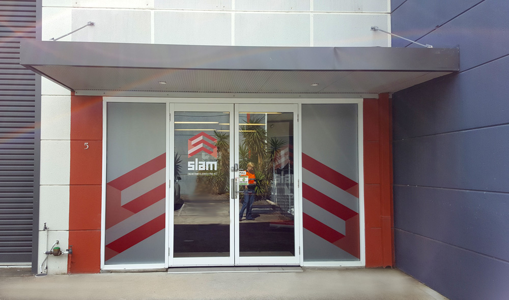
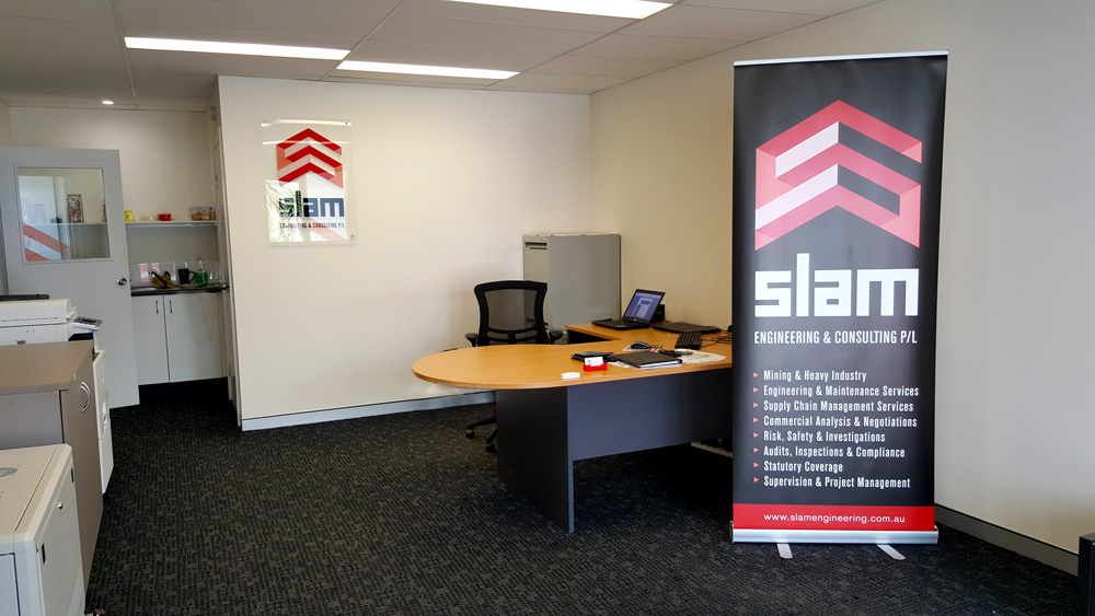
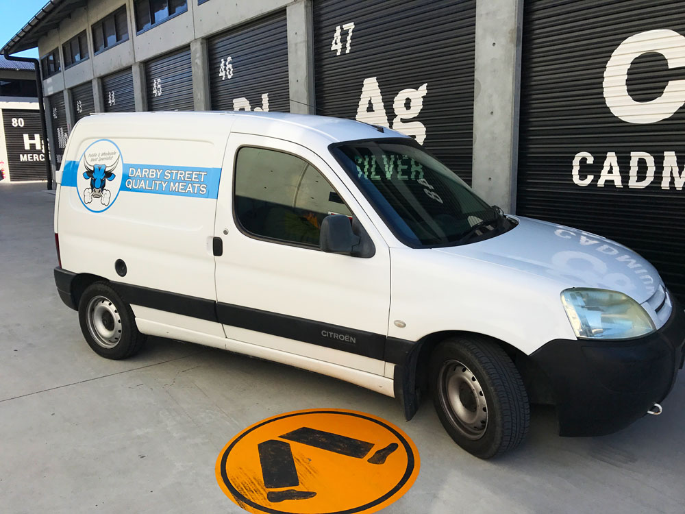
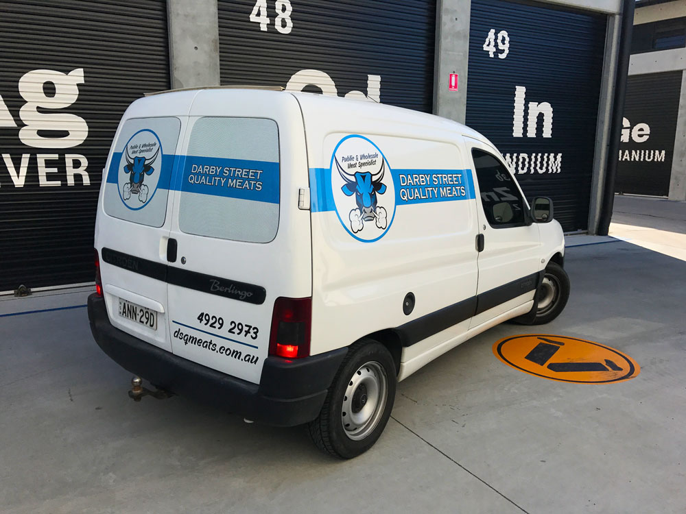
Fresh Decals for Slam Engineering
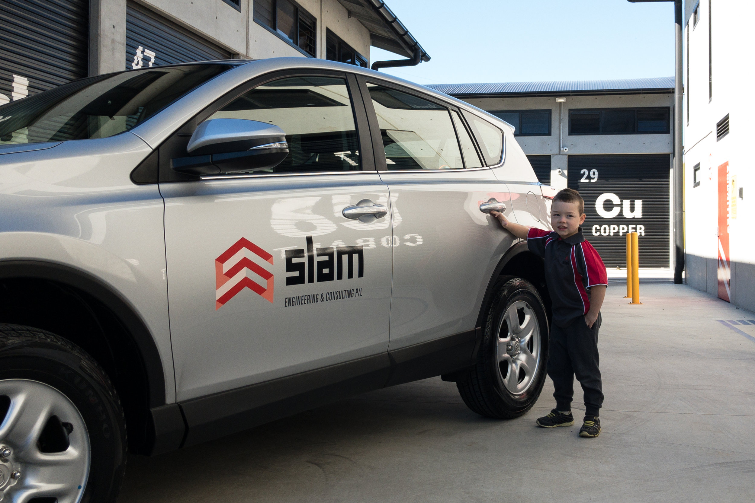
We were asked by our friends at Slam Engineering to apply their brand onto their new Rav4 vehicles. 
Simple and smart was our brief

Lucky their brand was well designed to accommodate for any format, so were able to design the decals to fit anywhere on the vehicle body.

MATERIALS USED


SKINTAC HX190WG2

Printable cast PVC film

This product is specially dedicated to full wraps, wall wraps or complex surfaces. The combination of highly conformable cast vinyls and the HEX’PRESS technology offers high-quality results while reducing the application time. 


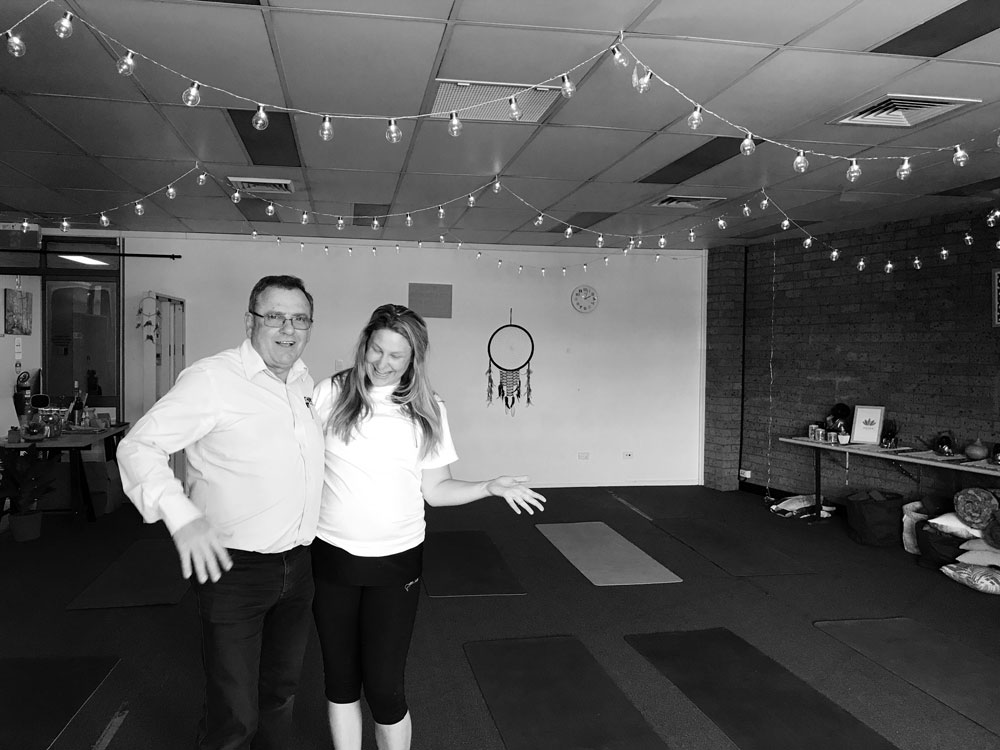
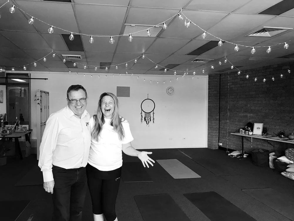
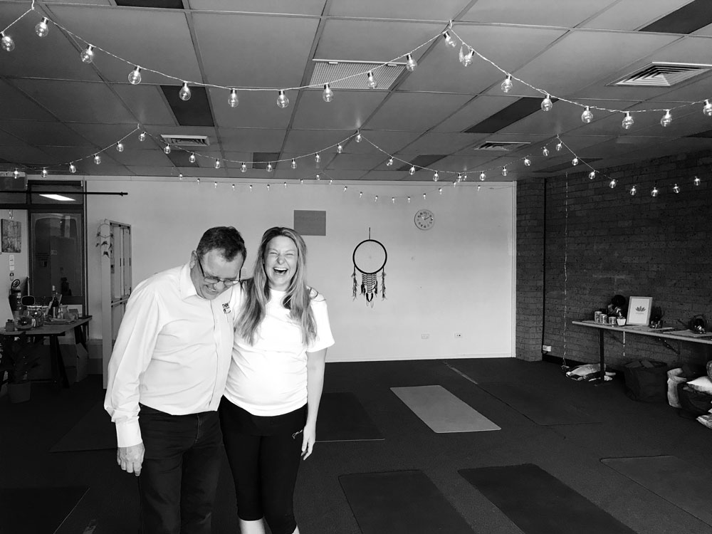
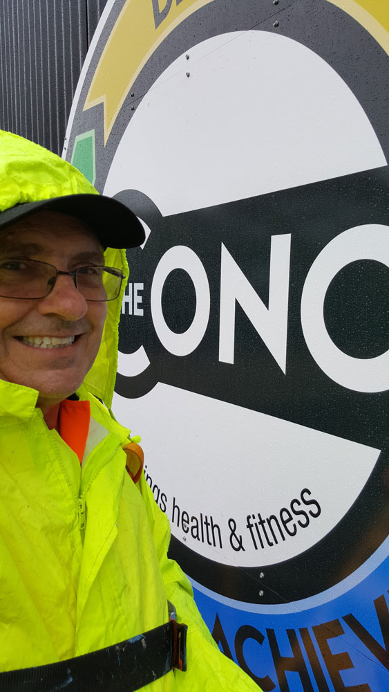
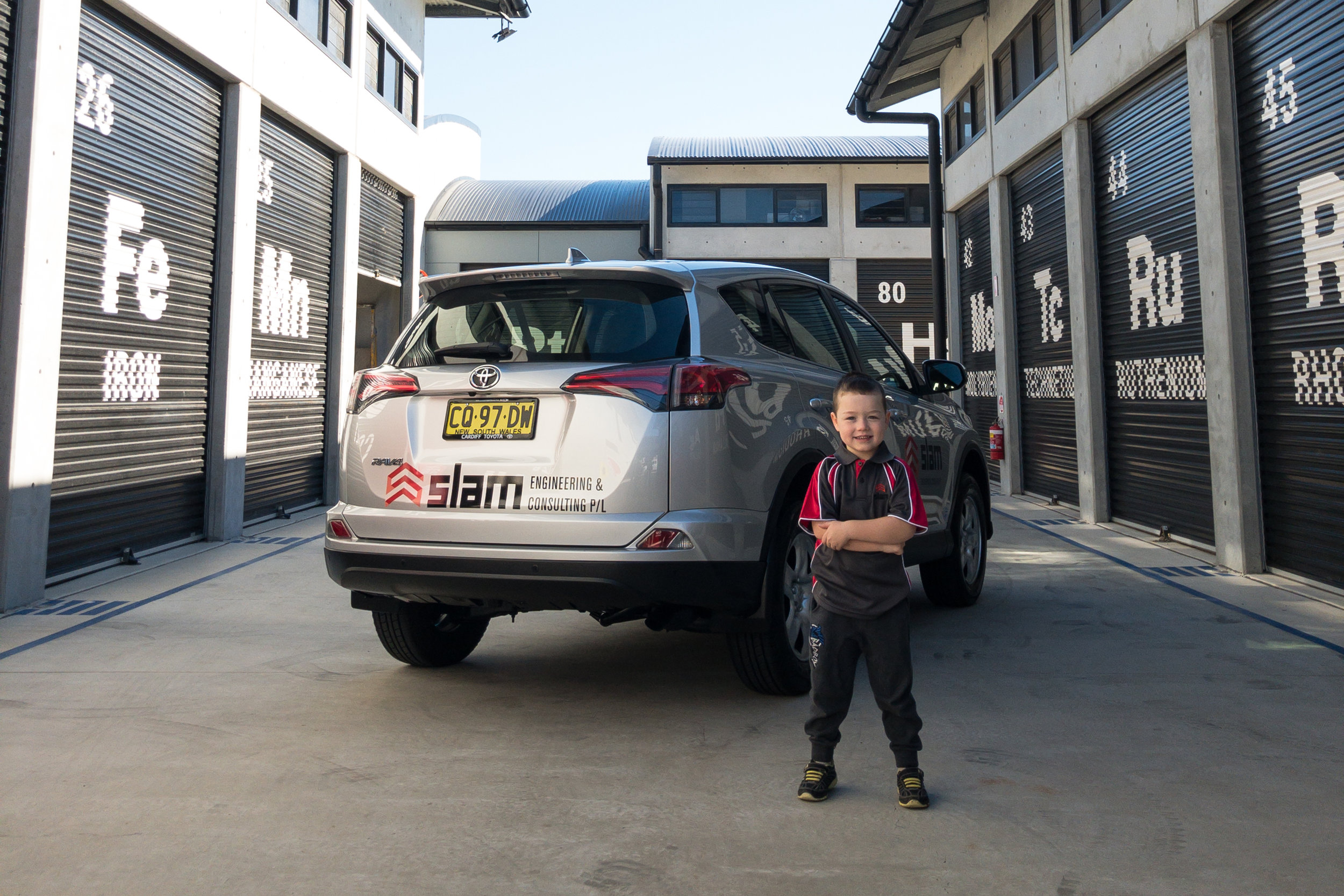
Luckily the brand rep was happy with our work! I think his smile says it all.

(Yes there is a car behind our cute model)


For those who don't know the Slam Engineering & Consulting team have over 100 years mining experience

Working on, designing, leading and managing resources for fixed plant and mobile equipment maintenance.

This experience was obtained through working for major mining houses, large consultancy firms and respected suppliers for both open-cut, underground and processing operations in the coal, metalliferous and bauxite commodities.

2018 LeMons car race design is hot!

Another year another lemon. This years 24 hour of LeMons car entrant for our fantastic crew from Millfields Turkeys in Stroud  is our best yet.

A fun play on Hotwheels was their inspiration this time, and I think that we nailed it. 

Love this design and it was sooo much fun to design.

What the heck? What the Hell!


24 Hours of Lemons presents Australian endurance racing for $999 cars. It’s a breeding ground for inflated egos and God like status… in their own minds. It's where Mercedes and Mazda, Toyota and Hyundai do battle for the glory of gloating rights. All are winners if they make it to the end, which is the very point of LEMONS... To FINISH!!

Make sure you get behind these guys.

printing service


Think Graphic Communication offer a state of the art efficient printing service to business and the public.

Our range of items include, but are definitely not limited to: Business Cards, Booklets, Letterheads, Brochures, Triplicate Books, Invitations and Calendars.

What sets our service apart from a lot of competitors is our trained graphics team and the speed of our response to your request.

Our aim is to make your purchase as carefree as possible.

Everyone has a special offer nowadays and Think Graphic Communication are definitely no different in that regard.

start with the outside first

Your shopfront appearance is a key factor to getting customers in

If you are looking to attract more attention for your business – start with the outside first - shopfront signage.

Fascia signs, lightboxes, hanging signs through to frosted film windows or one way vision

Our team will collaborate with you to help transform your shopfront almost any way imaginable.

Being able to create and express your image to the public is such a rewarding project


Where should you go for branding?

The obvious place is Think Graphic Communication

Our aim is to make it as easy as possible for people to notice you

Everything from your business cards to your building signage or even branded environment projects. Our team will design artwork to show you what the finished product will look like and make it work for you over a variety of applications. Print, embroidery, online, signs or vehicles.


Jolly fun with coffee on the run

New on the streets Jolly Beans Mobile Coffee!

Jolly Beans came to us with an existing logo but they weren't quite happy with it, so we enjoyed updating their logo

The Think Team had fun creating this logo- tribal foundations,


bright happy colours, floral and fauna annnd coffee how could you not.


The colour palette was chosen to reflect Marie's bright, happy personality. We also tried to implement her heritage in our logo design.

Once you meet Marie you'll understand where 'Jolly' comes from in the name.

When everyone was happy with the logo concept the trailer design was created


jolly beans trailer unbranded.jpg

Jolly Beans mobile coffee trailer

clean and white white with great curves, before the fantastic happy makeover


Fresh, bold and joyful - that was the aim


jolly beans design.jpg

design concept

jolly beans in the making


As you can see from the photos taken from Marie herself and shared on her FB page, the final design turned out great!.

Simple, clean and bright

Only the best materials were used for the installation ensuring quality and durability for the prints.


I’m beyond happy with the signage on my coffee trailer. I had an idea in my head and Chanelle and the team brought it to life. The service was amazing, always got back to be quickly with design ideas. I can’t thank you guys enough and I will be back for some merchandise!
— Marie Pung
 

LEOGATE ESTATE WINES


What a hard days work this was!

Leogate Estate Winery is simply gorgeous

Brokenback Vineyard was planted in the mid to late 1970’s by a Rothbury Estate Syndicate led by the late Len Evans AO, OBE. Over the ensuing years the vines have produced premium wines which have been sold under a variety of labels.


As stunning as this looks there was no branding on the entrance of the enormous building. So our job was to make an impression as you drove up the driveway.

 
Photograph of Front of Winery.JPG

Before  

Royce still needs to paint his magic


Handpainted directly to the surface these letters were over a metre high and spanned around 17 metres long.


The current vineyard has 50 hectares under vine, comprising Chardonnay (18.1ha), and Semillon (3.9ha) on the flat gravelled soils and Shiraz (28ha) on the eastern and western-facing slopes of the adjacent rise as well as Verdelho (2.5ha) and Tempranillo (1ha) which were planted in 2009 (which Royce had to test them all).


All-new Swift is here

And it’s even better than before.

With its enhanced design, the latest technology, exhilarating turbo performance and advanced preventative safety features, this is the revolution of an icon that has already sold over five million units worldwide.


Design for the promotion

Our job was to make this great car seen for the crew from Kelly Suzuki Gateshead

To do this we ran the lettering on an angle to create some movement, in bright reds contrasting with the blues and black as it sat on the brilliant yellow background.

Large was the key for this design being a small car, and the blue has such a fresh, vibrant feel.


And of course the unmistakable Suzuki logo for easy recognition.

Hexis vinyl materials were applied to make this masterpiece look effective


Totally rebuilt and refined from the ground up, the powerful, distinctive styling features a low, wide stance and sleek muscular lines that create a bolder, more striking impression.


So step into the brand new Swift and experience everything that has made it a true icon — and more.
If you like the look of the car give Richard a call at Kelly Suzuki Gateshead

RTC grand entrance


What a grand site as you step out of the elevator at the RTC building in Newcastle!

This brilliant timeline was designed by local designer, and good friend of ours Josh Vincent.

It depicts the early years of The RTC group showing classic images of Richard Claut as a younger lad, through to today. It is amazing how far you have come, and you just don't appreciate it until it is shown to you. And what a stylish way to show the world.


Design Aspects

To complete this wall art we printed the supplied artwork onto wall paper vinyl, preparing the wall first of course, and added a third dimension mounting the brushed aluminium RTC logo off the wall with stand-offs.

The black and white images contrast greatly with the RTC yellow which leads you throughout the timeline. 

This was just the finishing touch to the office space for Rich and his crew

ALL-NEW CITROËN C3

A wind of change is blowing through the world of compact hatchbacks!

As unique as you are

Very fashionable, the all-new Citroën C3 is characterised by a trendy and optimistic design, animated by coloured inserts and graphic elements like the Airbump® panels. Its expressive and unique shape makes it immediately recognisable in its segment. Style, personalisation, Citroën Advanced Comfort®, new technologies, optional ConnectedCAM Citroën™ and more…

 
citroen-c3-passenger-think-graphic-communication.jpg
 

Design for the promotion

Eye catching, bit of colour and clean were the specs from Dean @Pacific Euro.

To accomplish this bold clean, crisp lettering was angled along the sides of the car, with splashes of Citroen's colour palette of blues and greenish/yellow


Love at first site!

The unique shape of the all-new C3 sets itself apart with a charismatic front face and generous curves which give it a powerful and energetic stance. Its smooth lines, its graphic signature and its colours make it a trendy and “pop” model. With the C3, free yourself and go with today’s trends!


If you like the look of the car give Dean a call down at Pacific Euro Gateshead today

Holden Equinox

Like you, this SUV has nothing to prove

The perfect SUV for real life

You can’t always predict what’s next, but who’d want to?

So Holden designed an SUV that’s built to have your back. Like luxury leather–appointed seats you can sink into in style but are also easy to clean. Or a panoramic glass sunroof to sunbathe like a boss and top up your vitamin D after a day in the office. And that’s just for starters.

equinox-car-promotional-signs-driver-side.jpg

Design for the promotion

Our job was to make this great car seen for the crew from Kelly Holden Cardiff

To do this we used bold clean, crisp lettering splashed along the sides of the car, in white and silver for high contrast against the red.


Fancy tech included points were applied to the rear and front of the car providing more details of the features the Equinox has to offer


And of course the unmistakable Holden logo for easy recognition.

A variety of materials were used- one way vision, clear printed vinyl on the Gerber, Avery cast and metallic, Hexis repostik all to make this masterpiece look effective


No fancy names, just heaps of great features to make every day easier.
If you like the look of the car give Andreas Andreou a call down at Kelly Holden Cardiff

Komatsu interior decor

Komatsu was looking for a way to make their offices, although they were neat, a little more interesting for the workers and visitors.

So that is where we stepped in.

Working with the team from Komatsu was great, they were so helpful with anything. They wanted a way to showcase some of their machinery and branded imagery around the office walls, creating some movement and colour to the office environment.


We worked with various materials such as etch vinyl, perpex panels, wall paper vinyl to create different moods at various locations around the walls and glass doors


Frosted Glass Artwork

Such a nice look - rugged, industrial images displayed around the office walls and glass doors.

This image was printed on etch vinyl and applied to the glass doors to the staff room.

An excellent way to provide privacy and showcase some branding ideas.


Front Counter Sign

What a great idea - a DNA timeline!

This sign was applied on clear perspex with a matte finish for a clean, non reflective finish, and mounted off the wall with stand-offs.

Interesting and informative, making a boring wall inspiring, considering this is the first thing you see as you enter the reception


Complete hallway canvases

We brought some life to the pure white office with this awesome shot of the mining trucks.

Once you walk down the 6m long hallway you feel like you need to dust yourself off. Wrapping the image around the wall with wall paper created such a great impact, as you walked into the office you got that initial wow factor, as well as finishing off the look neatly.


Komatsu had this brilliant shot of the Sydney Harbour Bridge, which just had to be put on display, so once again we wallpapered this space. The blue pops across the room, creating a calm feel in the office. The gentleman that worked at that station loved the look.


Love the look?

Contact us to see how we can help bring some life to your own workplace and inspire a great energy flow.


Darby Street Butchers branded

Think carved it up with Kyle and Chanelle at Darby Street Quality Meats rebranding their image.

I know what you saying... another Chanelle!!! Well you wouldn't believe it there are not 1 but 2 Chanelles working there, so I felt right at home

Back to the story

The crew were happy with the bull and blue colours of their original logo, but just wanted it to have a bit more grunt and attitude. 

darby street quality meats logoname in circle.png
darby street quality meats old logo.jpg

old logo

he was tough but not enough

darby-street-quality-meats-jerky.jpg

The Think Team also had to consider how the logo could be manipulated for the butchers meat tray labels and sooo delicious beef jerky labeling. OMG it makes my mouth water just thinking about it this stuff is goood. You have to try it!

So just the head of the beast was chosen, front on so you were looking straight into the eyes

We updated the front window keeping the image low to allow light and vision into the display. If you look up at the roof sign of the front facade you will also see the new logo standing proud overlooking the street.


Internally we got to have a bit of fun designing the feature wall

We noticed some old black and white photos of the butchers forever back in the hay day hanging on the wall. These had to be used in our design for the wall behind the counter. 

 
darby-street-quality-meats-internal-signs.jpg
 

The display cabinet has a static vinyl running across the top with whiteboard strips so specials can be hand written as they change, bit of a personal touch we thought. Inside the cabinet we designed labels for the variety of delicious meats they have on display, once again laminated with whiteboard panels allowing for hand written descriptions and ease of changing the labels.

 
think-business-branding-on-tshirts.jpg

stamped

custom printed shirts, long sleeves and caps, mobile advertising


Vehicle signage

For the vehicles Kyle and Chanelle were just looking for something clean and not too loud. One way vision micro perforated film was applied to the rear windows and Hexis premium digital printing car vinyl on the sides and back panels.


Black Hill Public Sports feature wall

Our design team had a great time creating this master sports feature wall for Black Hill Public School.

Black-Hill-Public-School-aboriginal-signs-think-graphic-communication.jpg

School signs

Aboriginal theme designs and colours


Bright earthy colours, Aboriginal theme designs, bold simple lettering such a good mix for an effective layout.


Our finished product was impressive, above and beyond what we had hoped for!

The signs were printed and laminated using Hexis vinyl then mounted on high quality aluminium composite panel for strength and a smooth, even flat surface. This way the signs are easy to  maintain and produce a beautiful finish.


Black Hill Public School is a safe, happy and caring environment that fosters positive self-esteem, develops self-motivation and self-discipline, so that each student can realise their own individual potential and be prepared for future challenges.

Our school was looking for a way to finish off our sports houses feature wall in a dynamic way. We went to Think Graphic Communication and were provided with the perfect way to complete the job. The concept and design was based on a simple colour and name based information.
— Matthew Braye

If you like what you we did for Black Hill Public School and would like something custom made for your own school please feel free to contact one of our friendly help team


GIFT IDEA FOR CHRISTMAS


Looking for a cool gift idea this year, why not promote your business with a custom cap?

Only 53 days till Christmas


custom design

order now for Christmas


Choose from a variety of colours :

  • Red and white
  • Navy blue and white
  • Gray and white
  • Black and Black
  • Red and Navy
  • Blue and white

Add your logo or any design with our HTV for that personal touch.


Need help with the design part? Don't worry our Think Design Team can handle that for you!


What Is Heat Transfer Vinyl?

Heat transfer vinyl (HTV) is a type of vinyl which is adhered to a substrate using heat. This may be done using a heat press machine.

HTV vinyl is not sticky, unlike adhesive vinyl, though the carrier sheet attached to the HTV is sticky.

There are lots of different types of heat transfer vinyl available. Glitter, holographic, flocked, and foil HTV are just a few of many options you can choose from, as well as a range of different color options.


shirts?

Custom printed with your design

We can press HTV onto:

  • T-shirts
  • Sweatpants
  • Jumpers
  • Hats and caps
  • Shoes
  • Swimsuits
  • Placemats
  • Teatowels
  • Baby and children’s clothes
  • Canvas tote bags and stretched canvas

and much more


Contact us and see how we can help transfer your image for you

Thinking Yoga with Sarge

This week we were a bit flexible and spent some time with Sarge at the Ohana Room in Cardiff

royce-at-ohana-applying-window-graphic.jpg

Ohana Signs


New face for the family Yoga room


Clean and simple was Sarge's request for these signs.

To get the message across quickly and easily from the carpark, decals were applied to the internal of the window panels. We used a medium weight  fontstyle keeping the sentences short and sweet, and kept the heart of the sign for the glorious Ohana logo.

 
royce-at-ohana-applying-window-graphic-silhouette.jpg
 

The Ohana Room means, 'family room' in Hawaiian

Of course we couldn't go there without actually striking some yoga poses for our pics. Even at 32 weeks pregnant Sarge is way more flexible than the 2 of us, and funnier too


I think that was Tree pose then it was time for Ballerina pose


If you are looking for a place to practice yoga you can't go past here. Sarge is a bundle of energy and always good for a laugh. They have members ranging in age from 6 weeks old to 81 years of age! 

A variety of Yoga Classes are on offer catering for Mums and Dads, Over 55's and serious Yogis intent on getting a sweat up in Hot Power classes. There is something for everyone at The Ohana Room. 

Mats and equipment supplied

 All you need to bring is a towel and a smile

ohana-yoga.jpg
the-ohana-room-yoga.jpg

The Concept brought to life


Think Graphic Communication helped make Newcastle's Newest Sporting and Fitness hub's dreams a reality!
 

The Concept Gym we shopfitted in Newcastle, is now located 16 George St Highfields right near the Azzurri Club and next door to our mates at Sports Clique

The Gym has loads of Hammerstrength Equipment, Group Classes, Crossfit and recovery facilities.


Similar theme to the old gym


1000s of Hand painted affirmations on the walls driving you to keep going!

Bright fluorescent colours highlight certain words for greater impact a theme carried out throughout all the rooms.

Higher up on the shed the walls are filled with sports memorabilia from all different codes - it looks amazing


Logo design


Josh Vincent tweeked the old logo and created a great brand for the new gym.

We branded the gym by clever placement of routed logos throughout the different spaces, adding more colour and life

Energetic sports images and the gym's slogans were combined for the front entrance on the automatic doors, designed creatively for an impressive lasting impact.


Every angle holds a message


Looking up we even applied decals to the support beams and metal framework

Custom canvases were designed and manufactured along with large posters and small framed posters and decals for mirrors


Custom signs made for every surface


For impact and colour one way vision was cleverly designed and applied to the front main doorway and back entrance to the cafe.

Support for local sporting teams were featured here along with more affirmations based around sporting teams. So when the teams are practicing in the nets, or just passing by they can be inspired to strive for greatness.


Privacy was established by using printed etching and printed images for doors and windows


Once again strong, powerful, uplifting images appropriate for the different rooms were applied throughout the gym such as the spa room below.

Every message used holds something personal for each individual.


The Concept Gym Newcastle packs a punch

The Think Team were at their best with this fitout at The Concept Gym.

There were so many interesting signs and displays that were custom made for the gym. From the moment you step out of your car you are met with the stunning figures and bright colours that just make you want to go inside and workout.

Here we achieved this great impact with the combination of one way vision, which allows light into the shop but you can see outside from the inside, fresh yellow and routed ACM sign for the main sign.

Step inside and it is just amazing!

Everywhere you look there are inspirational quotes and messages urging you to strive for your best and to keep going, never give up.


Walls, doors, windows even the equipment was used as a blank canvas.


Hand painted messages, posters, decals and canvases adorn the walls

Custom made canvases were made for the gym and hung, posters designed, decals laminating timber, punching bags or the lockers or even the toilet doors were applied. Each message was hand painted adding a personal touch, as if one of the members had drawn it themself.


In the Spin Room the Sydney Harbour Bridge and more inspirational quotes on the walls illuminate once the lights go out and the music starts pumping

 
the concept illuminate hand painted sign think graphic communication.JPG

watch this glow

This is amazing to see


We are so proud of this job and it was such a lot of hard work but soo much fun especially because of the great crew that work at the gym and helped us in any way that they could.


Newcourt Construction foundations laid

Newcourt is a design, building and construction company headquartered in Newcastle NSW, that invests and cares about their clients projects.

'We endorse "One Team, One Focus", by working collaboratively with our clients, consultants and subcontractors, ensuring that the project deliverables are achieved.'

Newcourt's primary asset is its experienced and dedicated team, that turn up each day with passion, energy and enthusiasm, to make our clients projects happen.


The logo design was kept clean and minimal, using colour and the bevelled constructions as the visual point

Creating another dimension gives the logo a greater depth and more substance

This style was carried through the whole marketing design


The use of a mobile billboard was not over cluttered as we kept the vehicle graphics in the same minimal manner

Both the website and business cards carried this feel of clean space and strength


view site


Achieving this brand image would not have been possible without first getting to know our client of course.

Without Fred's imput and vision for his future of his company we cannot create a memorable brand that is right just for him.

Our sole aim is to provide a service that will showcase the best of what you have to offer and expand your brand over all platforms.